
Ad variant pack preset
AI ad variation generator
AI ad variation generator for testing ad formats before you spend on media. Four static ads for one product and one set of words, each in a different proven format, made together as one set so you can test them side by side.
- Best for
- Testing ad formats before you spend on media, launch creative, retargeting sets that rotate the layout and keep the product
- Output
- Image
- Time
- under 3 min
- Credits
- 32 credits for the pack of four est.
Already have an account? Sign in
Start free with 36 credits, no card needed. You land right in NOLGIA Agent, on this preset's questions, ready to run.
How to use it
NOLGIA Agent asks these questions in a chat, one at a time, with your own material.
Product photos
Add up to three photos from your device or your Library. One to three clear photos of the product. It appears exactly as shown on every ad.
What is the product?
Write it in your own words. Name it, what it is made of and roughly how big it is.
For example: A terracotta silicone slow feeder dog bowl with maze ridges, about 25 cm across
The words on the ads
Write it in your own words. Headline first, then up to three short lines, exactly as they should read. The same words go on all four ads. Only things that are true: we never invent claims, prices, ratings or reviews.
For example: Slow down dinner. Ridges pace every bite. Non slip base stays put.
Brand colors or moodOptional
Write it in your own words. Color names or codes, or a feeling in a few words. You can skip this.
For example: Deep navy with a coral accent, confident and clean
Your logoOptional
Add a photo from your device or your Library. Shown exactly as it is. You can skip this.
Where will they run?Optional
Pick one. The shape of all four ads.
- Feed 4:5
- Square 1:1
- Stories and Reels 9:16
- Banner 16:9
Create
One press of Create makes your image and saves it to your Library. The price is on the button, and nothing runs until you press it. It takes under 3 min.
About this preset
One product, one set of words, four proven ad formats, made together as a pack. You get a product hero, a feature callout grid, an us vs them split and a problem and solution ad, all sharing the same palette, the same type family and the same product lighting, so they read as one campaign and you can test the layouts against each other. Your product photos ride as references on every ad, so the product appears exactly as shown and is never redrawn. Every word on the ads is yours: write the headline and up to three short lines, and they are set exactly as you wrote them. Nothing is invented about your product, no claims, prices, ratings or reviews you did not give us. Choose the shape for where the ads run, and the pack lands in Outputs as one set that opens into a grid.
Use cases
- Testing four ad formats for one product before you spend on media
- A launch set that rotates the layout and keeps the product and the words
- Retargeting creative in four formats from one photo session
- A quick campaign board to show a client four directions at once
Examples
Made with this preset, with the prompt behind each one.
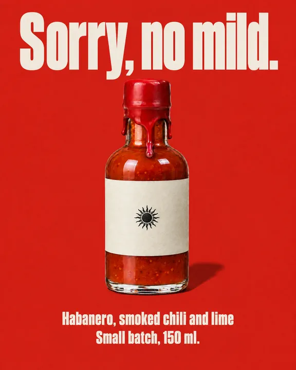
Product hero, an invented hot sauce on flat tomato red under one direct flash, the headline in the biggest type
A polished static direct to consumer ad for paid social, photoreal product photography composited with clean modern graphic design, agency grade finish, one of four ads in a pack that share the same palette, the same type family and the same product lighting, laid out exactly as THE FORMAT describes and filling the whole frame edge to edge. THE FORMAT: product hero, the product large and centered on a clean field of the brand color with the headline in the biggest type above it and the short lines beneath it in one tidy column, generous margins and nothing else in the frame. THE PRODUCT: a short squat clear glass bottle about 12 cm tall filled with a deep red-orange hot sauce, the cap dipped in glossy red wax that drips down the neck, a plain cream paper label with one small black sun mark and no words. The product matches the reference photos exactly; do not redesign, restyle, recolor, or reinterpret it; keep the same shape, materials, proportions, label and details, at a believable true scale, lit by one direct on-camera flash with a crisp hard shadow and glossy highlights on the glass, with fine 35mm film grain. THE COPY: exactly these lines and nothing else, each set on its own line, reproduced character for character with no punctuation added or removed: line 1 (the headline) Sorry, no mild. / line 2 Habanero, smoked chili and lime / line 3 Small batch, 150 ml. Every word on the ad comes from THE COPY and is spelled exactly as written there, set in one clean bold sans serif family with the headline the largest, perfectly legible at feed size; the product itself carries only the markings its reference photos show, so an unlabelled product stays unlabelled. THE BRAND: a flat tomato red field with cream and black type in an ultra condensed heavy sans, the bold energy of a late 90s print ad. Use only the brand names, logos and trademarks the customer includes in their request; never add real-world brands, logos or trademarked designs the customer did not mention.
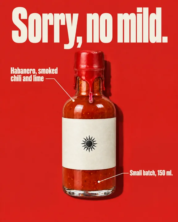
Feature callouts, one label per line of the same copy
A polished static direct to consumer ad for paid social, photoreal product photography composited with clean modern graphic design, agency grade finish, one of four ads in a pack that share the same palette, the same type family and the same product lighting, laid out exactly as THE FORMAT describes and filling the whole frame edge to edge. THE FORMAT: feature callout layout, the product large at the center on a clean background, one thin leader line and label per supplied copy line, each line used exactly once and the headline label largest; one or two supplied lines mean one or two labels, never pad the layout with invented or repeated text. THE PRODUCT: a short squat clear glass bottle about 12 cm tall filled with a deep red-orange hot sauce, the cap dipped in glossy red wax that drips down the neck, a plain cream paper label with one small black sun mark and no words. The product matches the reference photos exactly; do not redesign, restyle, recolor, or reinterpret it; keep the same shape, materials, proportions, label and details, at a believable true scale, lit by one direct on-camera flash with a crisp hard shadow and glossy highlights on the glass, with fine 35mm film grain. THE COPY: exactly these lines and nothing else, each set on its own line, reproduced character for character with no punctuation added or removed: line 1 (the headline) Sorry, no mild. / line 2 Habanero, smoked chili and lime / line 3 Small batch, 150 ml. Every word on the ad comes from THE COPY and is spelled exactly as written there, set in one clean bold sans serif family with the headline the largest, perfectly legible at feed size; the product itself carries only the markings its reference photos show, so an unlabelled product stays unlabelled. THE BRAND: a flat tomato red field with cream and black type in an ultra condensed heavy sans, the bold energy of a late 90s print ad. Use only the brand names, logos and trademarks the customer includes in their request; never add real-world brands, logos or trademarked designs the customer did not mention.
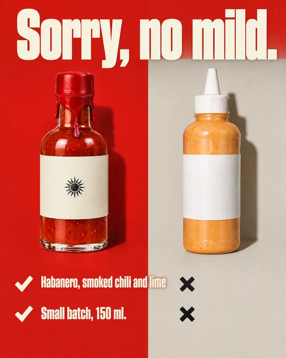
Us vs them, the sauce beside a plain unnamed squeeze bottle
A polished static direct to consumer ad for paid social, photoreal product photography composited with clean modern graphic design, agency grade finish, one of four ads in a pack that share the same palette, the same type family and the same product lighting, laid out exactly as THE FORMAT describes and filling the whole frame edge to edge. THE FORMAT: us versus them, a split layout with the product on the brighter left side under the headline and a plain unnamed generic clear plastic squeeze bottle of pale orange sauce with a blank white label, an unnamed generic alternative, on the muted right side, short comparison rows beneath with bold check marks on the left and crosses on the right; the headline is set once above the product and the remaining copy lines appear only as the comparison rows, each line exactly once, never repeated as a subhead or caption. THE PRODUCT: a short squat clear glass bottle about 12 cm tall filled with a deep red-orange hot sauce, the cap dipped in glossy red wax that drips down the neck, a plain cream paper label with one small black sun mark and no words. The product matches the reference photos exactly; do not redesign, restyle, recolor, or reinterpret it; keep the same shape, materials, proportions, label and details, at a believable true scale, lit by one direct on-camera flash with a crisp hard shadow and glossy highlights on the glass, with fine 35mm film grain. THE COPY: exactly these lines and nothing else, each set on its own line, reproduced character for character with no punctuation added or removed: line 1 (the headline) Sorry, no mild. / line 2 Habanero, smoked chili and lime / line 3 Small batch, 150 ml. Every word on the ad comes from THE COPY and is spelled exactly as written there, set in one clean bold sans serif family with the headline the largest, perfectly legible at feed size; the product itself carries only the markings its reference photos show, so an unlabelled product stays unlabelled. THE BRAND: a flat tomato red field with cream and black type in an ultra condensed heavy sans, the bold energy of a late 90s print ad. Use only the brand names, logos and trademarks the customer includes in their request; never add real-world brands, logos or trademarked designs the customer did not mention.
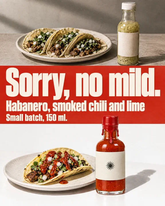
Problem and solution, bland tacos on top, the sauce on a fresh taco below
A polished static direct to consumer ad for paid social, photoreal product photography composited with clean modern graphic design, agency grade finish, one of four ads in a pack that share the same palette, the same type family and the same product lighting, laid out exactly as THE FORMAT describes and filling the whole frame edge to edge. THE FORMAT: problem and solution, the top half a close shot of the everyday problem in muted tones, a plate of plain tacos next to a generic bottle of pale, watery sauce with a blank label, and the bottom half the product solving it under the bright flash, a few drops of its deep red sauce on a fresh taco beside it, the headline stating the problem and the next line the answer. THE PRODUCT: a short squat clear glass bottle about 12 cm tall filled with a deep red-orange hot sauce, the cap dipped in glossy red wax that drips down the neck, a plain cream paper label with one small black sun mark and no words. The product matches the reference photos exactly; do not redesign, restyle, recolor, or reinterpret it; keep the same shape, materials, proportions, label and details, at a believable true scale, lit by one direct on-camera flash with a crisp hard shadow and glossy highlights on the glass, with fine 35mm film grain. THE COPY: exactly these lines and nothing else, each set on its own line, reproduced character for character with no punctuation added or removed: line 1 (the headline) Sorry, no mild. / line 2 Habanero, smoked chili and lime / line 3 Small batch, 150 ml. Every word on the ad comes from THE COPY and is spelled exactly as written there, set in one clean bold sans serif family with the headline the largest, perfectly legible at feed size; the product itself carries only the markings its reference photos show, so an unlabelled product stays unlabelled. THE BRAND: a flat tomato red field with cream and black type in an ultra condensed heavy sans, the bold energy of a late 90s print ad. Use only the brand names, logos and trademarks the customer includes in their request; never add real-world brands, logos or trademarked designs the customer did not mention.
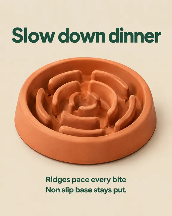
Product hero, the headline above the product on a clean field
A polished static direct to consumer ad for paid social, photoreal product photography composited with clean modern graphic design, agency grade finish, one of four ads in a pack that share the same palette, the same type family and the same product lighting, laid out exactly as THE FORMAT describes and filling the whole frame edge to edge. THE FORMAT: product hero, the product large and centered on a clean field of the brand color with the headline in the biggest type above it and the short lines beneath it in one tidy column, generous margins and nothing else in the frame. THE PRODUCT: a matte terracotta orange silicone slow feeder dog bowl with raised maze ridges inside, a wide flat rim and a non slip base, about 25 cm across, unbranded. The product matches the reference photos exactly; do not redesign, restyle, recolor, or reinterpret it; keep the same shape, materials, proportions, label and details, at a believable true scale, lit by one soft key light from the upper left with consistent shadows. THE COPY: exactly these lines and nothing else, each set on its own line, reproduced character for character with no punctuation added or removed: line 1 (the headline) Slow down dinner / line 2 Ridges pace every bite / line 3 Non slip base stays put. Every word on the ad comes from THE COPY and is spelled exactly as written there, set in one clean bold sans serif family with the headline the largest, perfectly legible at feed size; the product itself carries only the markings its reference photos show, so an unlabelled product stays unlabelled. THE BRAND: a warm neutral palette with one deep green accent, calm and premium. Use only the brand names, logos and trademarks the customer includes in their request; never add real-world brands, logos or trademarked designs the customer did not mention.
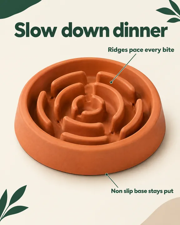
Feature callouts, one label per line of your copy
A polished static direct to consumer ad for paid social, photoreal product photography composited with clean modern graphic design, agency grade finish, one of four ads in a pack that share the same palette, the same type family and the same product lighting, laid out exactly as THE FORMAT describes and filling the whole frame edge to edge. THE FORMAT: feature callout layout, the product large at the center on a clean background, one thin leader line and label per supplied copy line, each line used exactly once and the headline label largest; one or two supplied lines mean one or two labels, never pad the layout with invented or repeated text. THE PRODUCT: a matte terracotta orange silicone slow feeder dog bowl with raised maze ridges inside, a wide flat rim and a non slip base, about 25 cm across, unbranded. The product matches the reference photos exactly; do not redesign, restyle, recolor, or reinterpret it; keep the same shape, materials, proportions, label and details, at a believable true scale, lit by one soft key light from the upper left with consistent shadows. THE COPY: exactly these lines and nothing else, each set on its own line, reproduced character for character with no punctuation added or removed: line 1 (the headline) Slow down dinner / line 2 Ridges pace every bite / line 3 Non slip base stays put. Every word on the ad comes from THE COPY and is spelled exactly as written there, set in one clean bold sans serif family with the headline the largest, perfectly legible at feed size; the product itself carries only the markings its reference photos show, so an unlabelled product stays unlabelled. THE BRAND: a warm neutral palette with one deep green accent, calm and premium. Use only the brand names, logos and trademarks the customer includes in their request; never add real-world brands, logos or trademarked designs the customer did not mention.
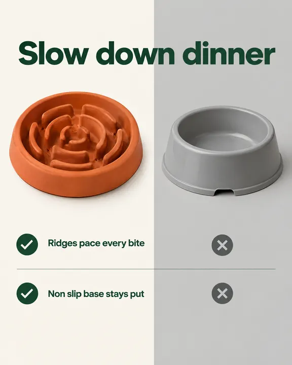
Us vs them, your product beside a plain unnamed alternative
A polished static direct to consumer ad for paid social, photoreal product photography composited with clean modern graphic design, agency grade finish, one of four ads in a pack that share the same palette, the same type family and the same product lighting, laid out exactly as THE FORMAT describes and filling the whole frame edge to edge. THE FORMAT: us versus them, a split layout with the product on the brighter left side under the headline and a plain unnamed generic grey plastic dog bowl, an unnamed generic alternative, on the muted right side, short comparison rows beneath with bold check marks on the left and crosses on the right; the headline is set once above the product and the remaining copy lines appear only as the comparison rows, each line exactly once, never repeated as a subhead or caption. THE PRODUCT: a matte terracotta orange silicone slow feeder dog bowl with raised maze ridges inside, a wide flat rim and a non slip base, about 25 cm across, unbranded. The product matches the reference photos exactly; do not redesign, restyle, recolor, or reinterpret it; keep the same shape, materials, proportions, label and details, at a believable true scale, lit by one soft key light from the upper left with consistent shadows. THE COPY: exactly these lines and nothing else, each set on its own line, reproduced character for character with no punctuation added or removed: line 1 (the headline) Slow down dinner / line 2 Ridges pace every bite / line 3 Non slip base stays put. Every word on the ad comes from THE COPY and is spelled exactly as written there, set in one clean bold sans serif family with the headline the largest, perfectly legible at feed size; the product itself carries only the markings its reference photos show, so an unlabelled product stays unlabelled. THE BRAND: a warm neutral palette with one deep green accent, calm and premium. Use only the brand names, logos and trademarks the customer includes in their request; never add real-world brands, logos or trademarked designs the customer did not mention.
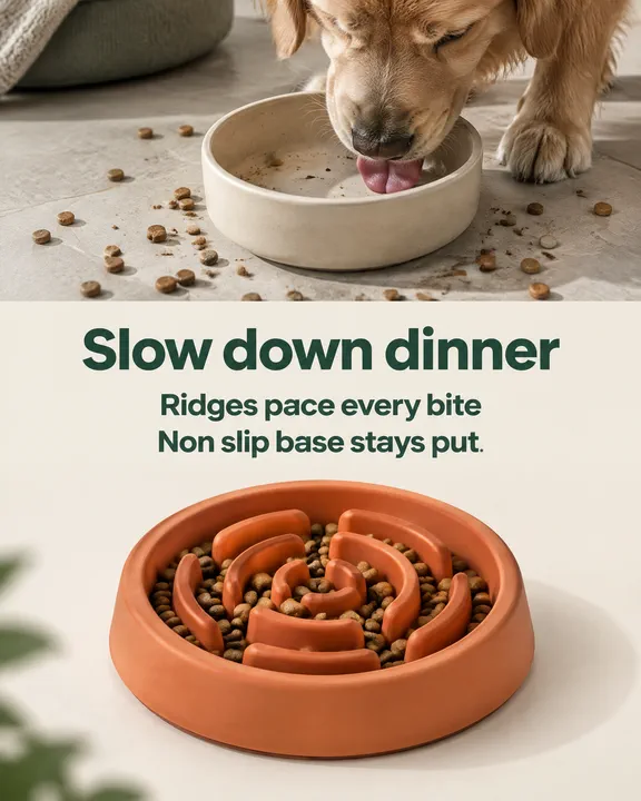
Problem and solution, the everyday problem above, your product below
A polished static direct to consumer ad for paid social, photoreal product photography composited with clean modern graphic design, agency grade finish, one of four ads in a pack that share the same palette, the same type family and the same product lighting, laid out exactly as THE FORMAT describes and filling the whole frame edge to edge. THE FORMAT: problem and solution, the top half a close shot of the everyday problem in muted tones, a plain bowl licked empty in seconds with kibble scattered on the floor around it, and the bottom half the product solving it in bright clean light, kibble held neatly in its ridges, the headline stating the problem and the next line the answer. THE PRODUCT: a matte terracotta orange silicone slow feeder dog bowl with raised maze ridges inside, a wide flat rim and a non slip base, about 25 cm across, unbranded. The product matches the reference photos exactly; do not redesign, restyle, recolor, or reinterpret it; keep the same shape, materials, proportions, label and details, at a believable true scale, lit by one soft key light from the upper left with consistent shadows. THE COPY: exactly these lines and nothing else, each set on its own line, reproduced character for character with no punctuation added or removed: line 1 (the headline) Slow down dinner / line 2 Ridges pace every bite / line 3 Non slip base stays put. Every word on the ad comes from THE COPY and is spelled exactly as written there, set in one clean bold sans serif family with the headline the largest, perfectly legible at feed size; the product itself carries only the markings its reference photos show, so an unlabelled product stays unlabelled. THE BRAND: a warm neutral palette with one deep green accent, calm and premium. Use only the brand names, logos and trademarks the customer includes in their request; never add real-world brands, logos or trademarked designs the customer did not mention.
Suggest directions for me
Say what you are making it for and NOLGIA suggests a few directions for Ad variant pack, each with a prompt and the options it sets. Nothing is generated until you use one.
Models it uses
The model NOLGIA Agent reaches for on this preset. Sign in to see live credit costs and capabilities from the model catalog.
GPT Image 2.5 Flare
image- Credits per generation
- 8 credits per image
Ready to make an Ad variant pack?
A few quick questions in the chat, your own material, and NOLGIA makes it.